


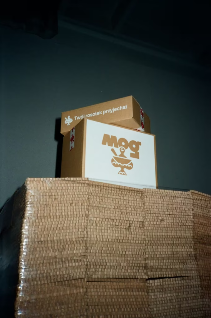


YEAR: 2024 CLIENT: MOG – Mother Of Gut
SERVICE: Packaging Design, User Experience, Sustainability Strategy, Icon Design
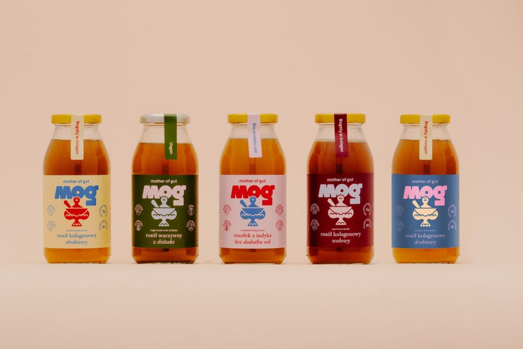
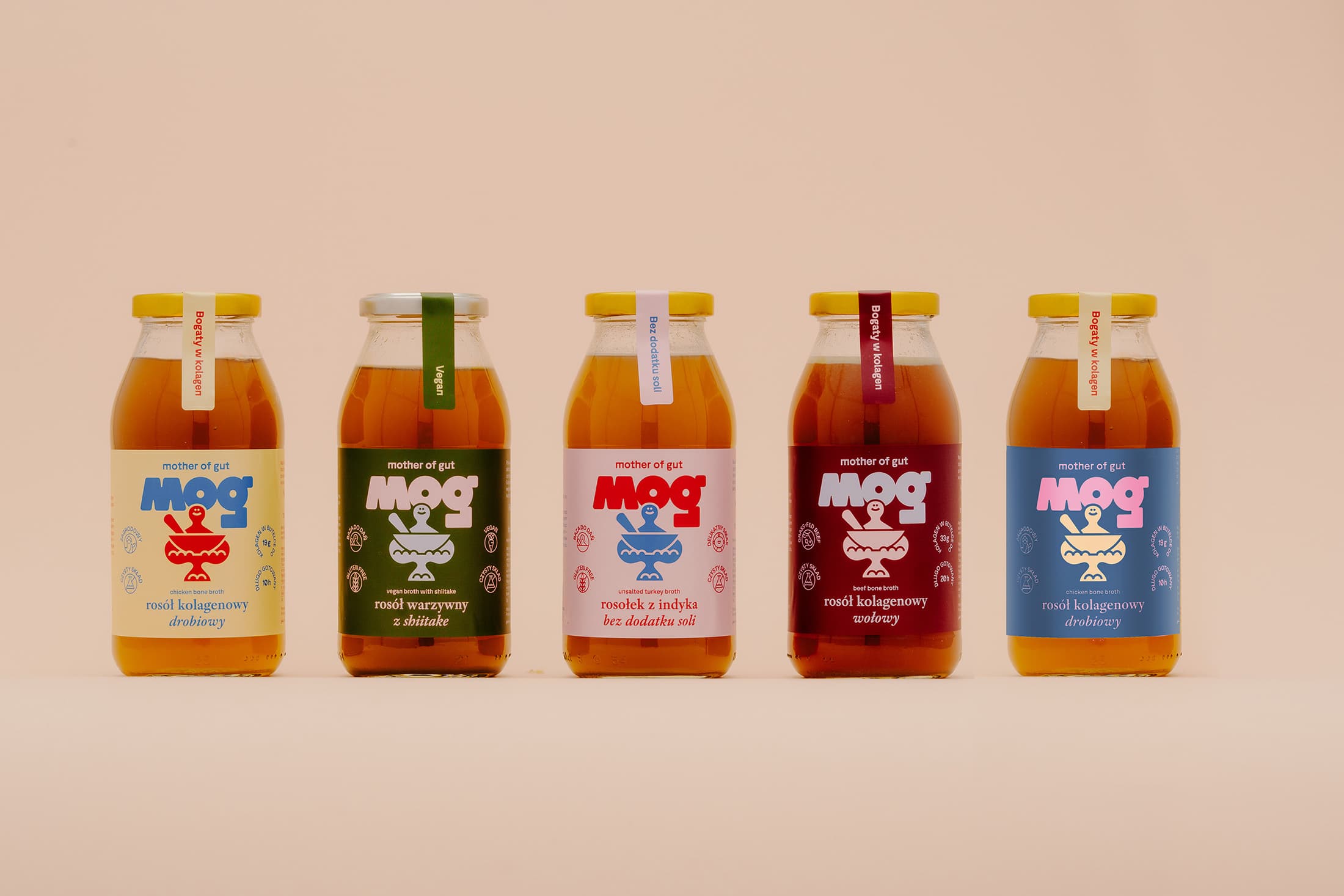
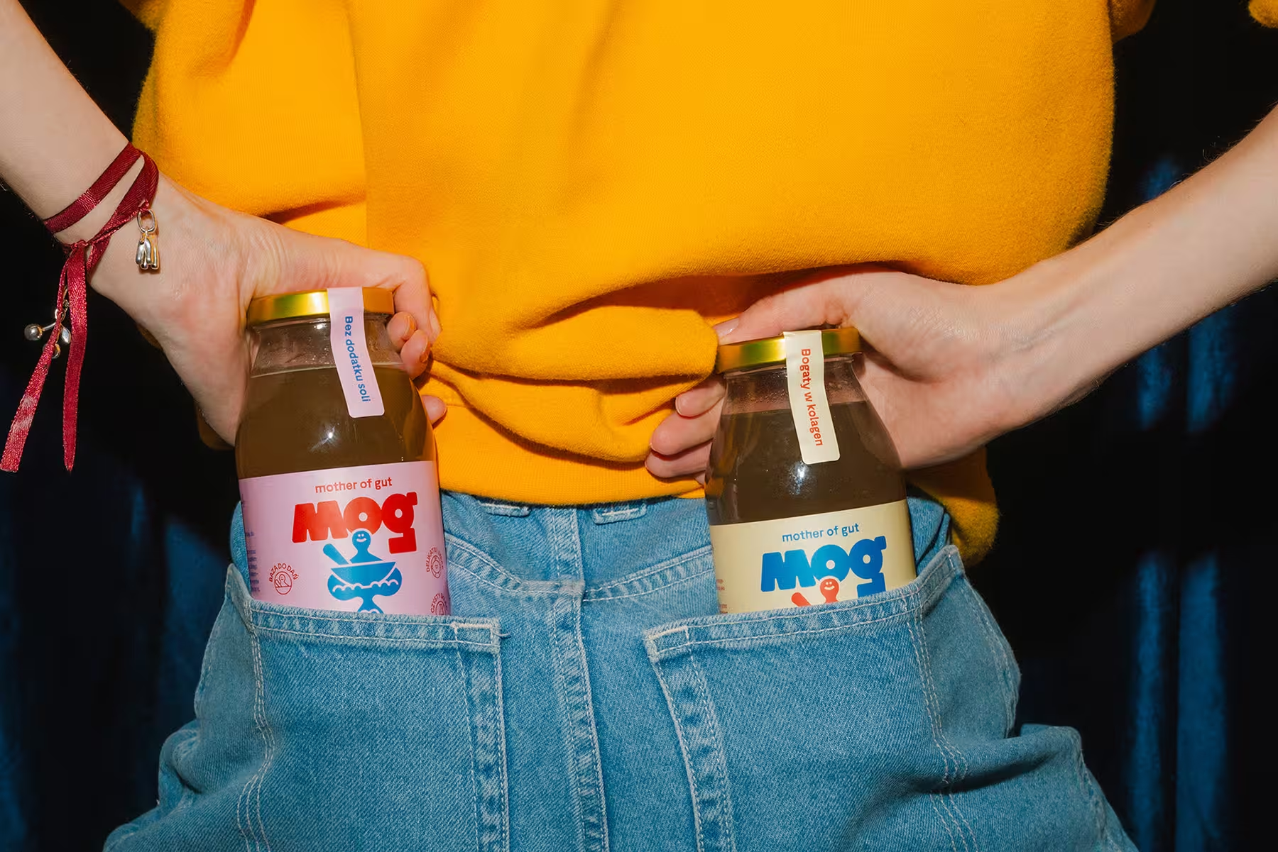
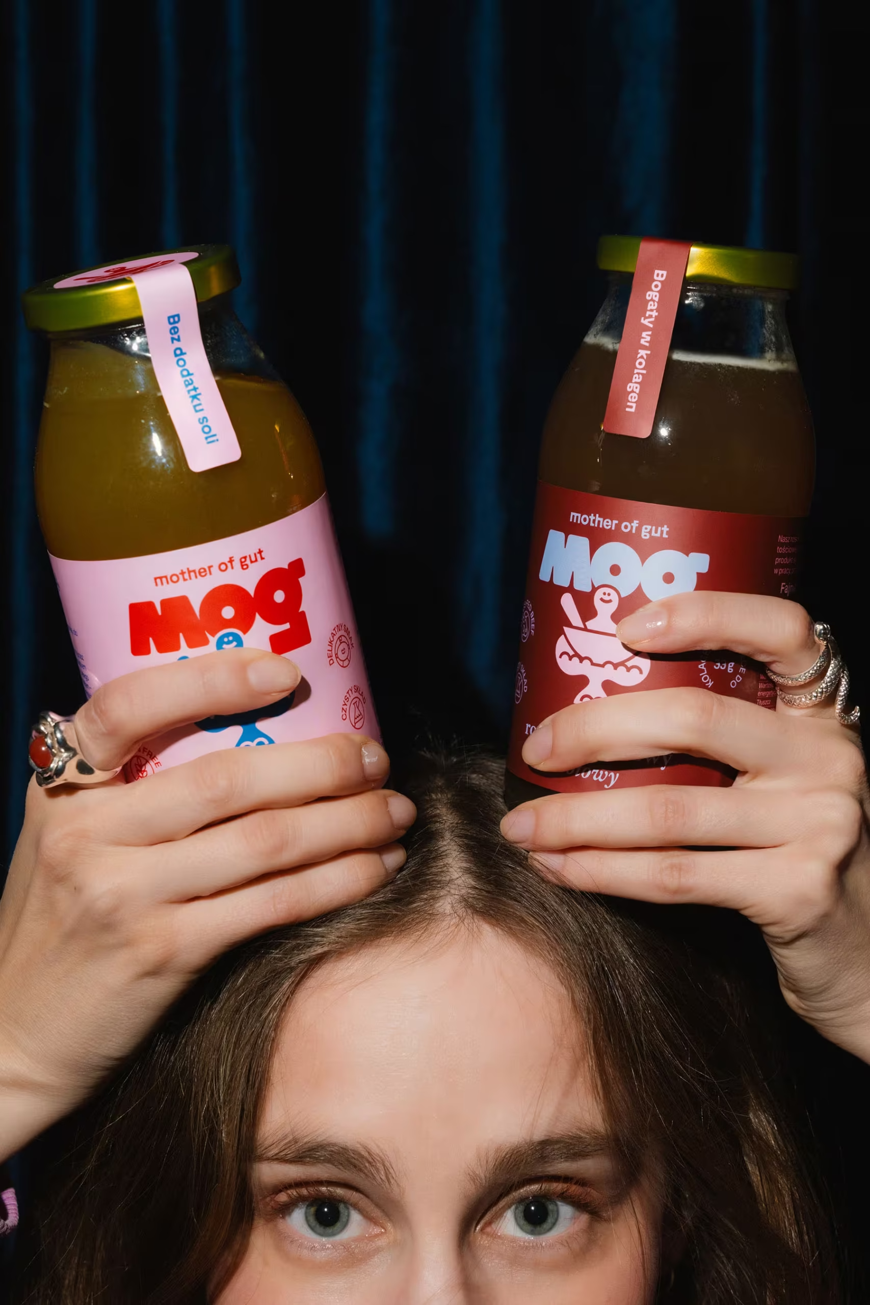
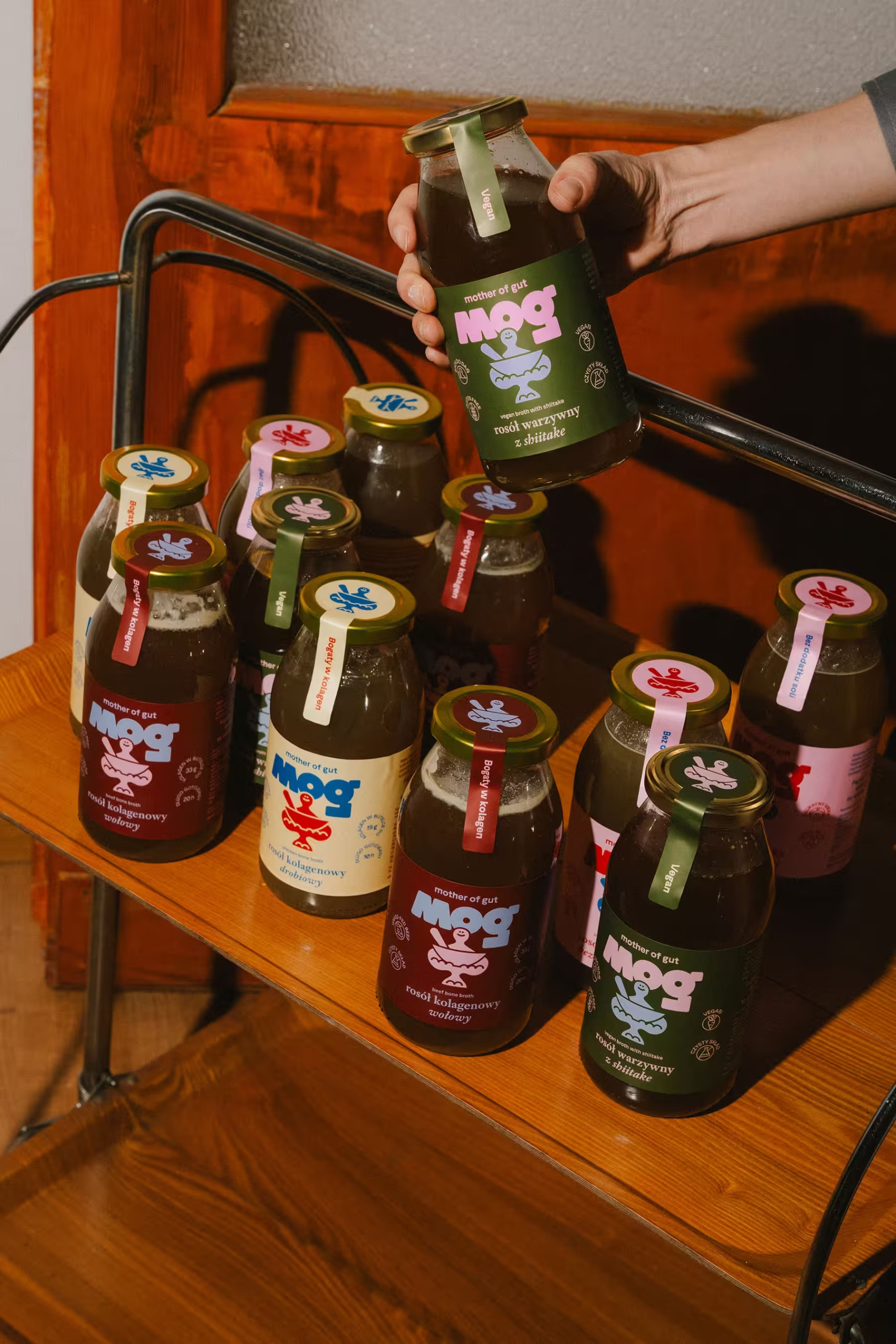
The packaging for MOG’s line of broths was designed with a focus on colour-coded clarity while strategically reinforcing logo recognition, ensuring a high-impact visual anchor for the brand’s market debut.
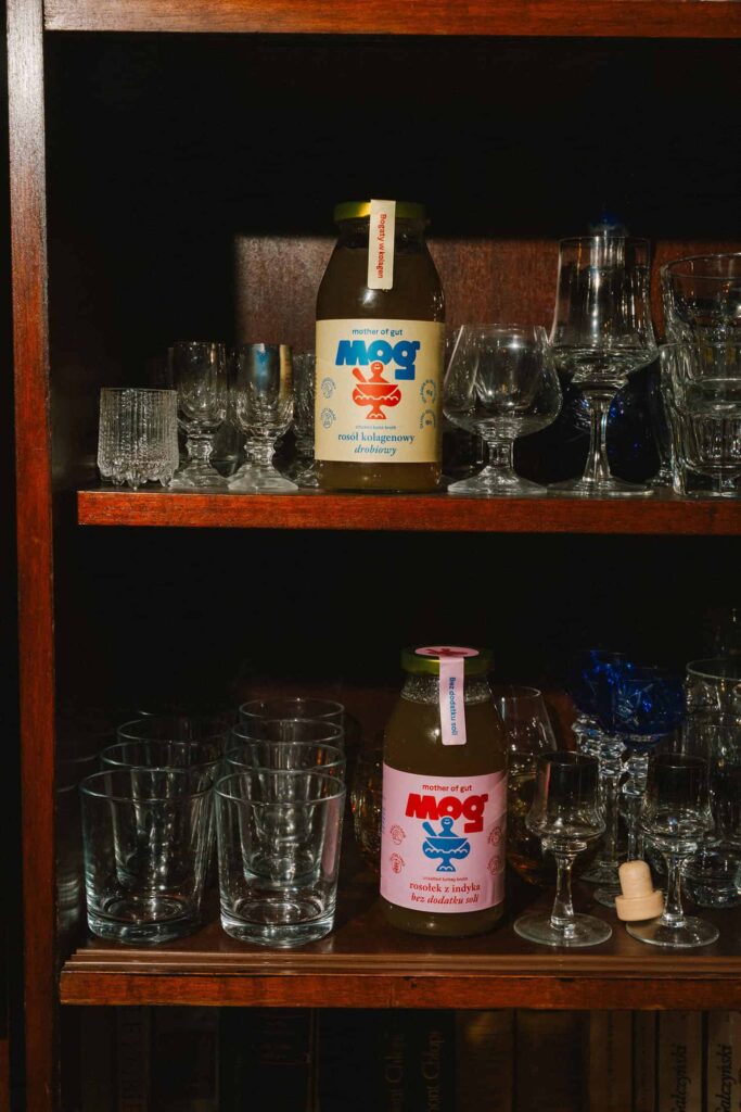
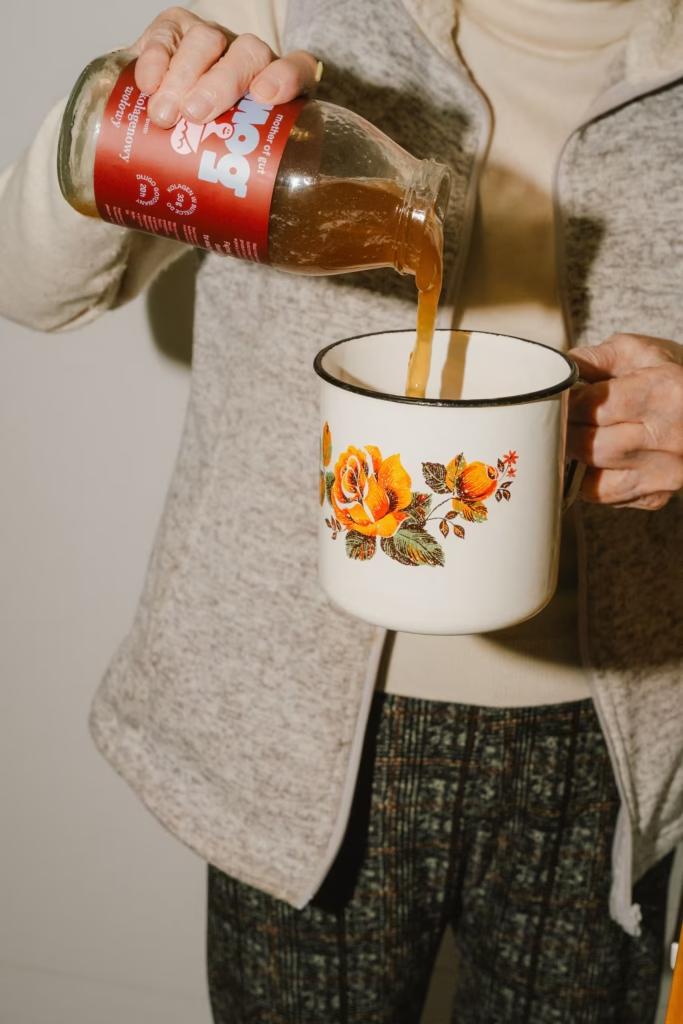
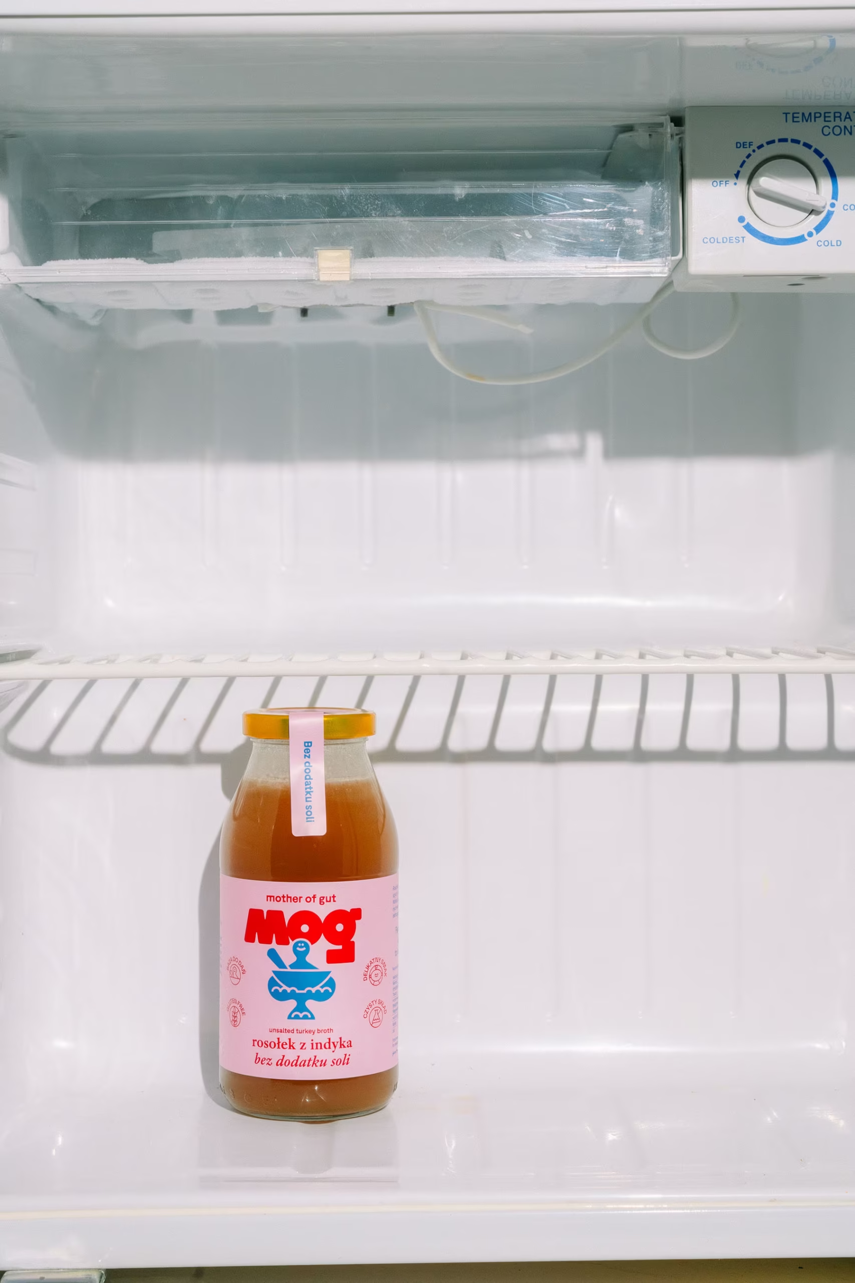
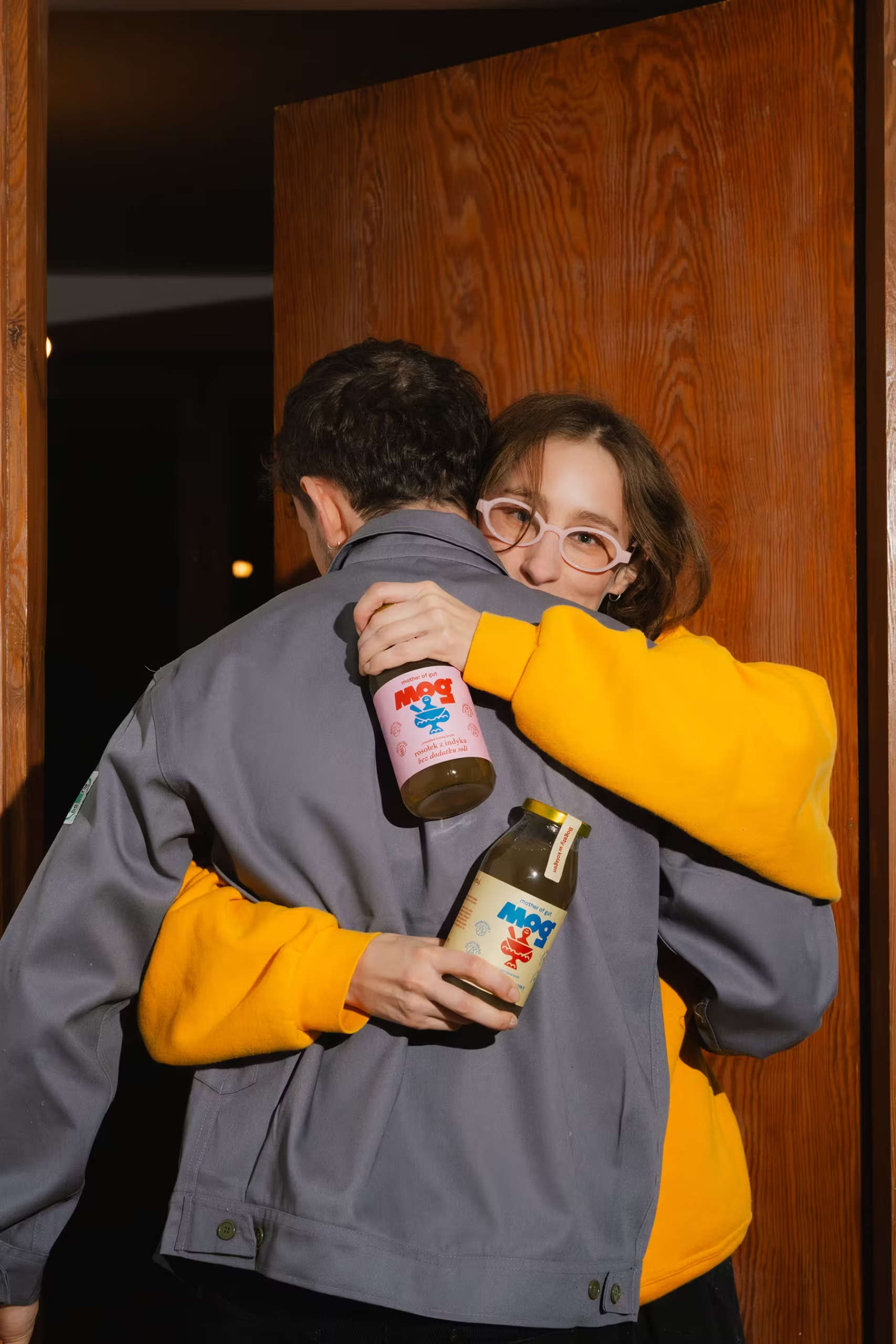
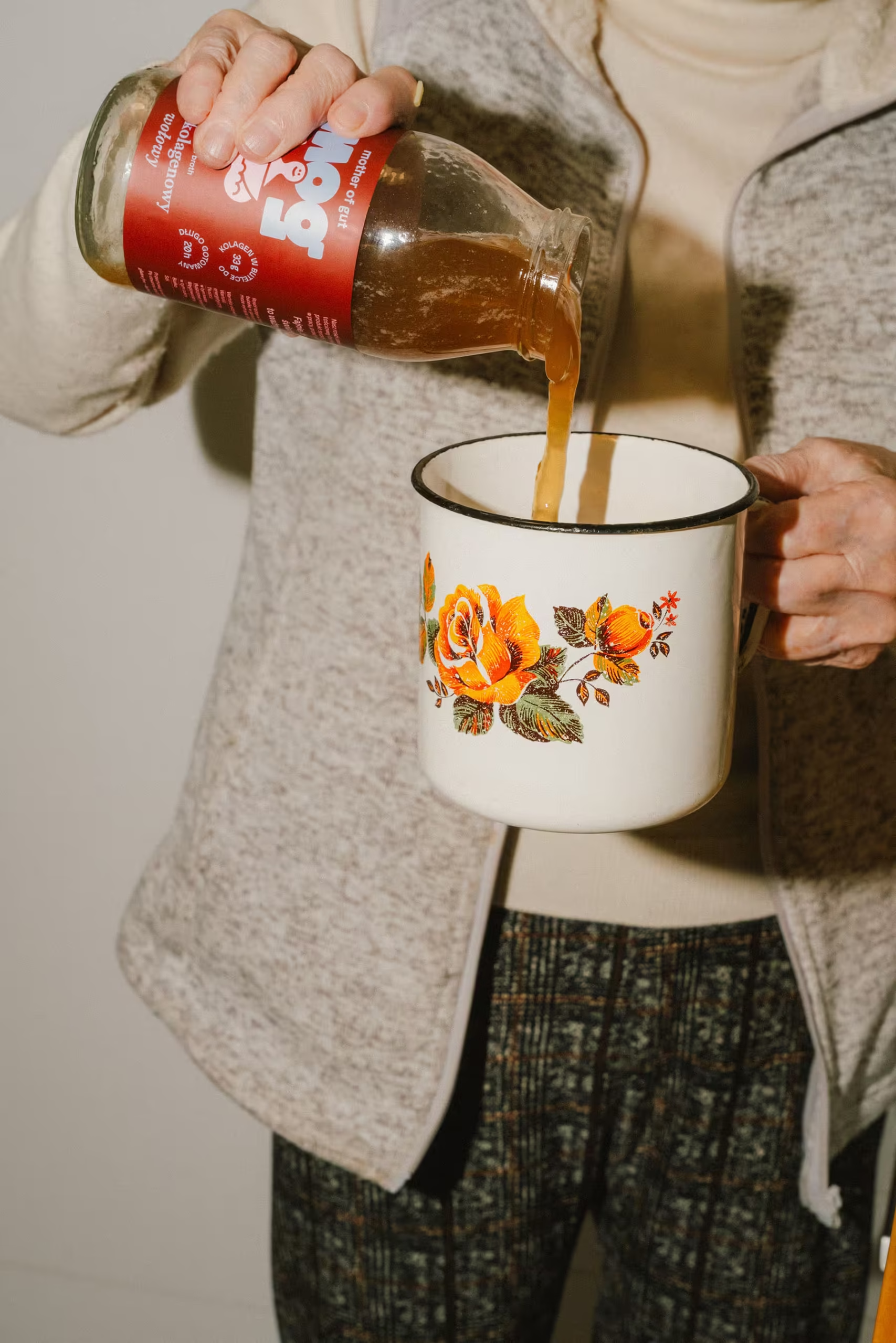
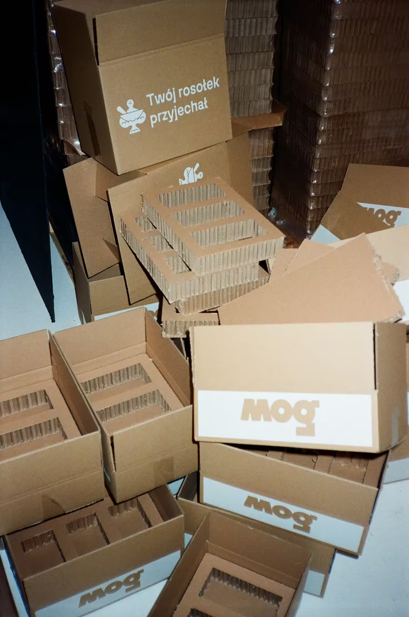
Drawing from the vibrant palette of the Mazovia region, each flavour is instantly identifiable: sunny yellow for classic chicken, deep burgundy for beef, soft pink for turkey, blue for fish and verdant green for the vegan option. The glass bottles feature wide necks for effortless pouring—even when the nutrient-dense broth has solidified—and a tamper-proof paper seal that allows for easy top-down identification in a refrigerator.
By choosing wide-neck glass bottles, the design enhances the User Experience (UX) for busy professionals and students alike, making the product mess-free and even drinkable on the go. The systematic, colour-coded visual language was designed with scalability in mind, allowing the brand to expand the range with new flavours while maintaining a cohesive and recognizable presence on the shelf. Furthermore, the decision to use returnable glass for subscribers transforms the packaging into a circular business model, building long-term brand loyalty and lowering environmental impact.