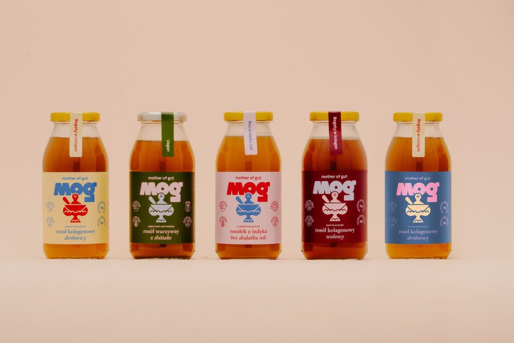


YEAR: 2024 CLIENT: MOG – Mother Of Gut
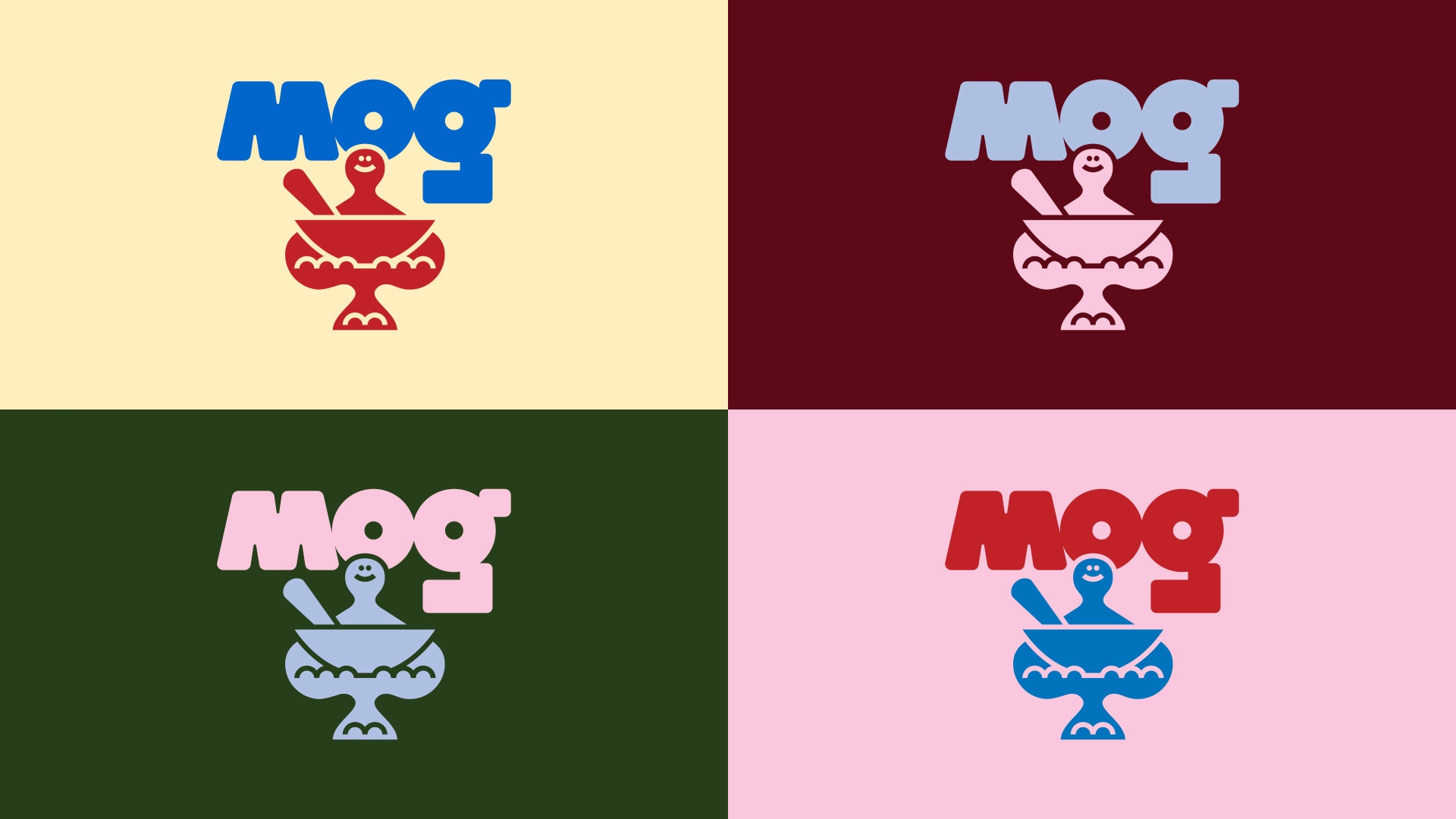
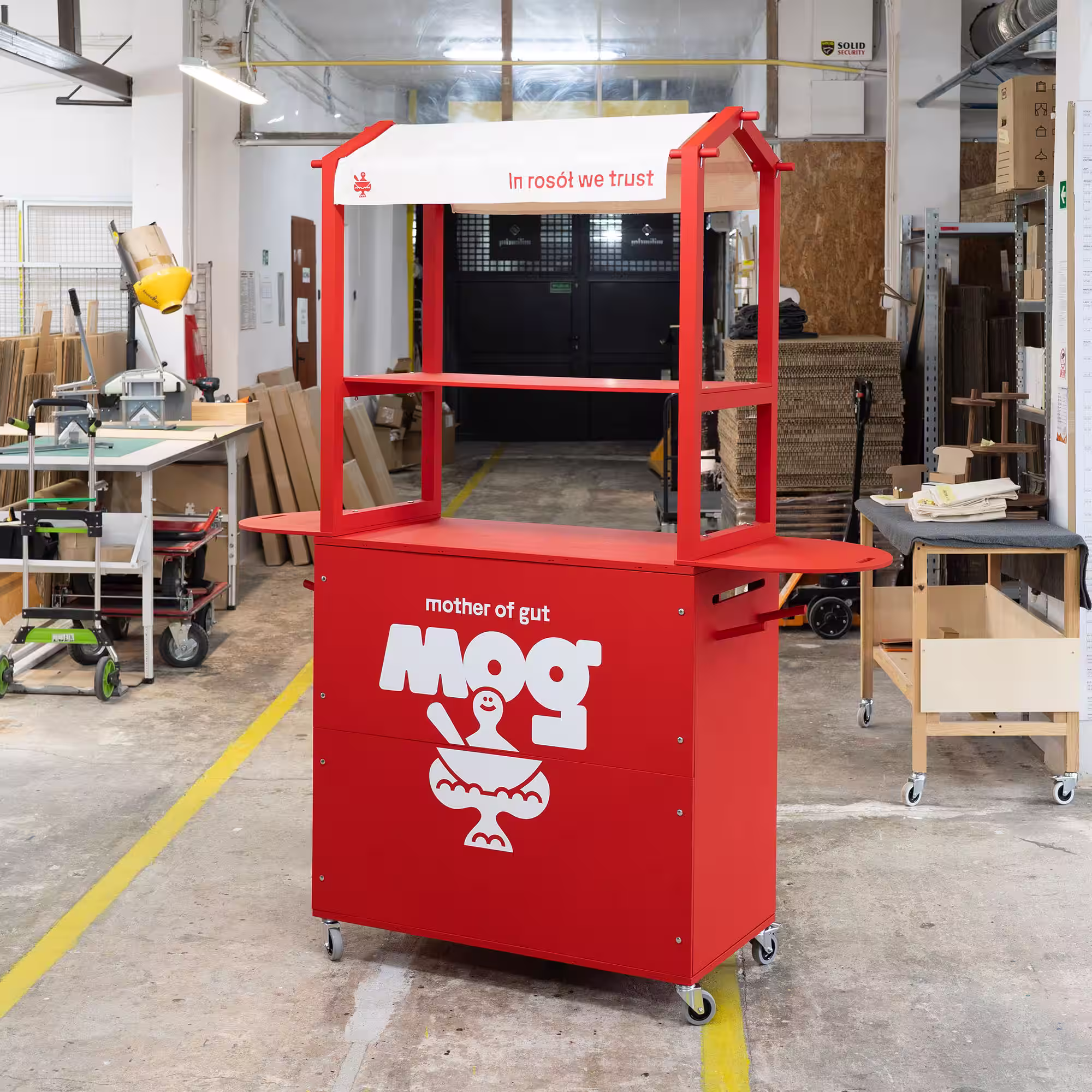
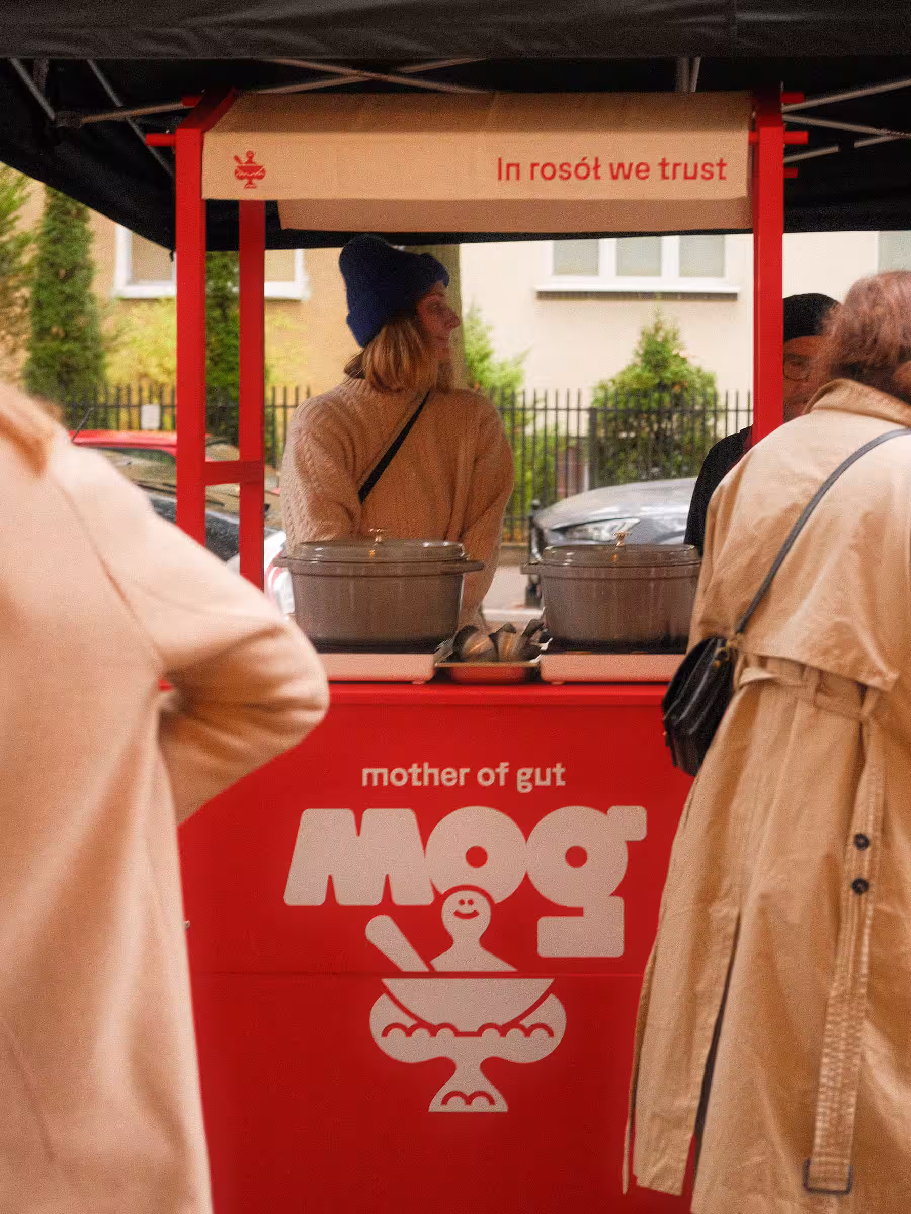
A New Folk Language. The visual identity for Mog (Mother of Gut) is an exercise in cultural sampling. It draws from the intricate world of Polish wycinanka (traditional paper cut-outs) and filters it through the bold, Polish graphic design style from the 1960s through the 80s. The result is a brand that feels nostalgic but avoids the “vintage” trap, staying sharp and contemporary.
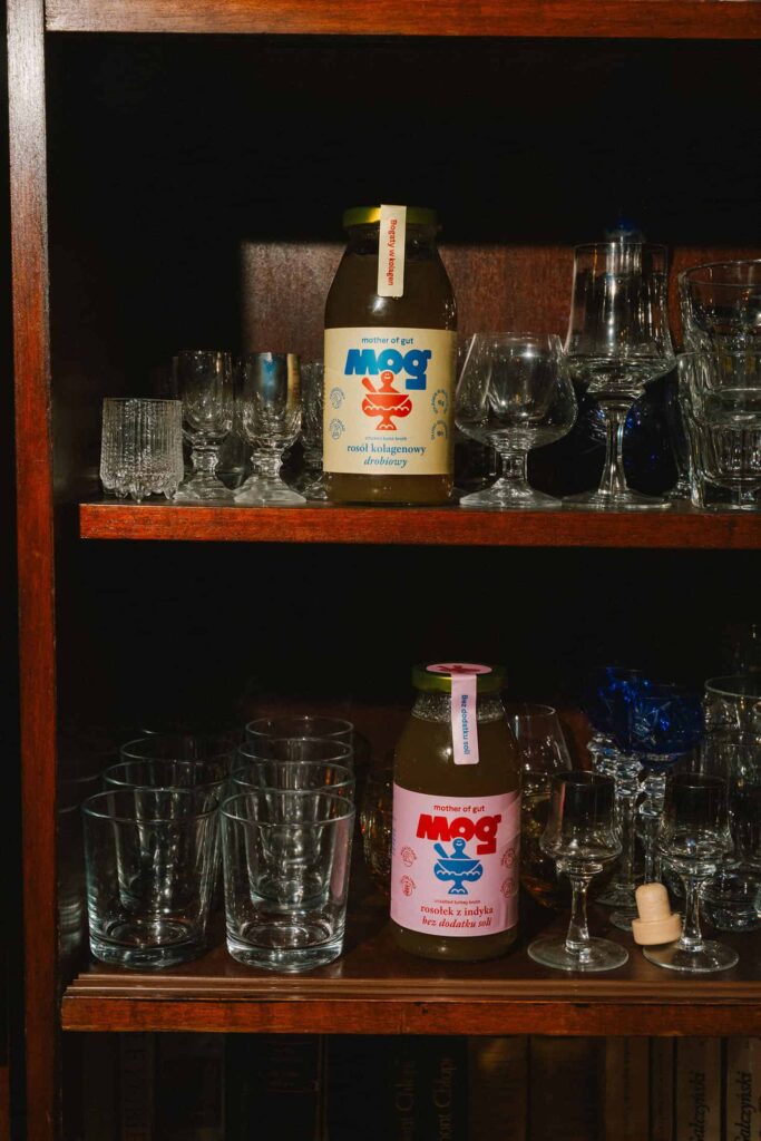
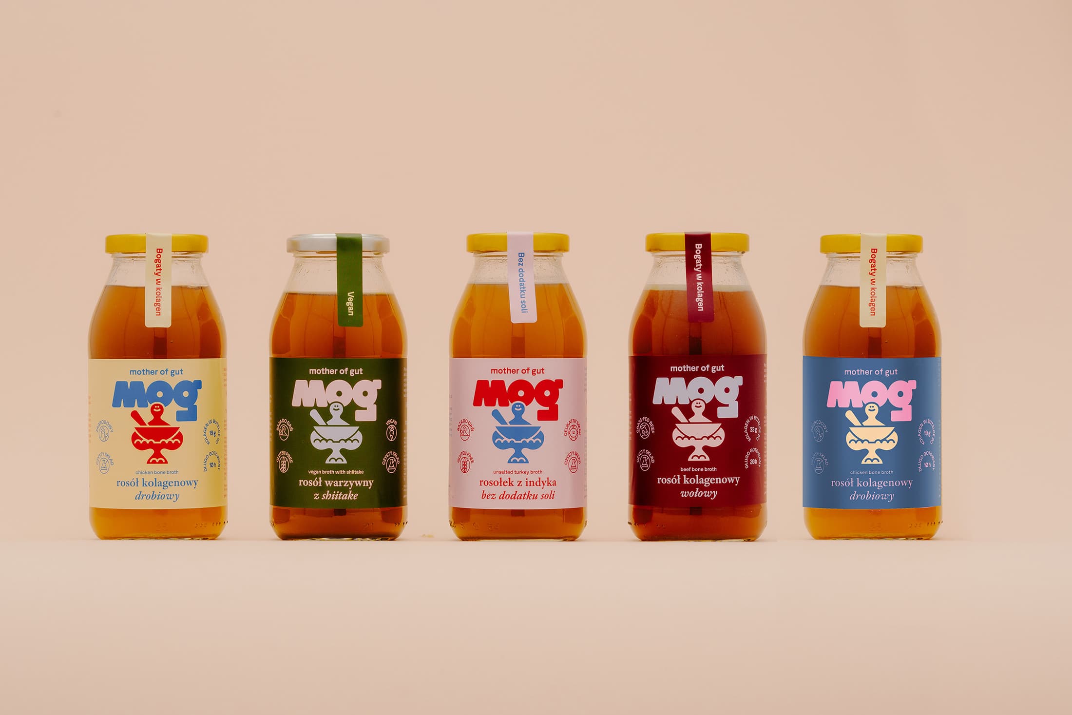
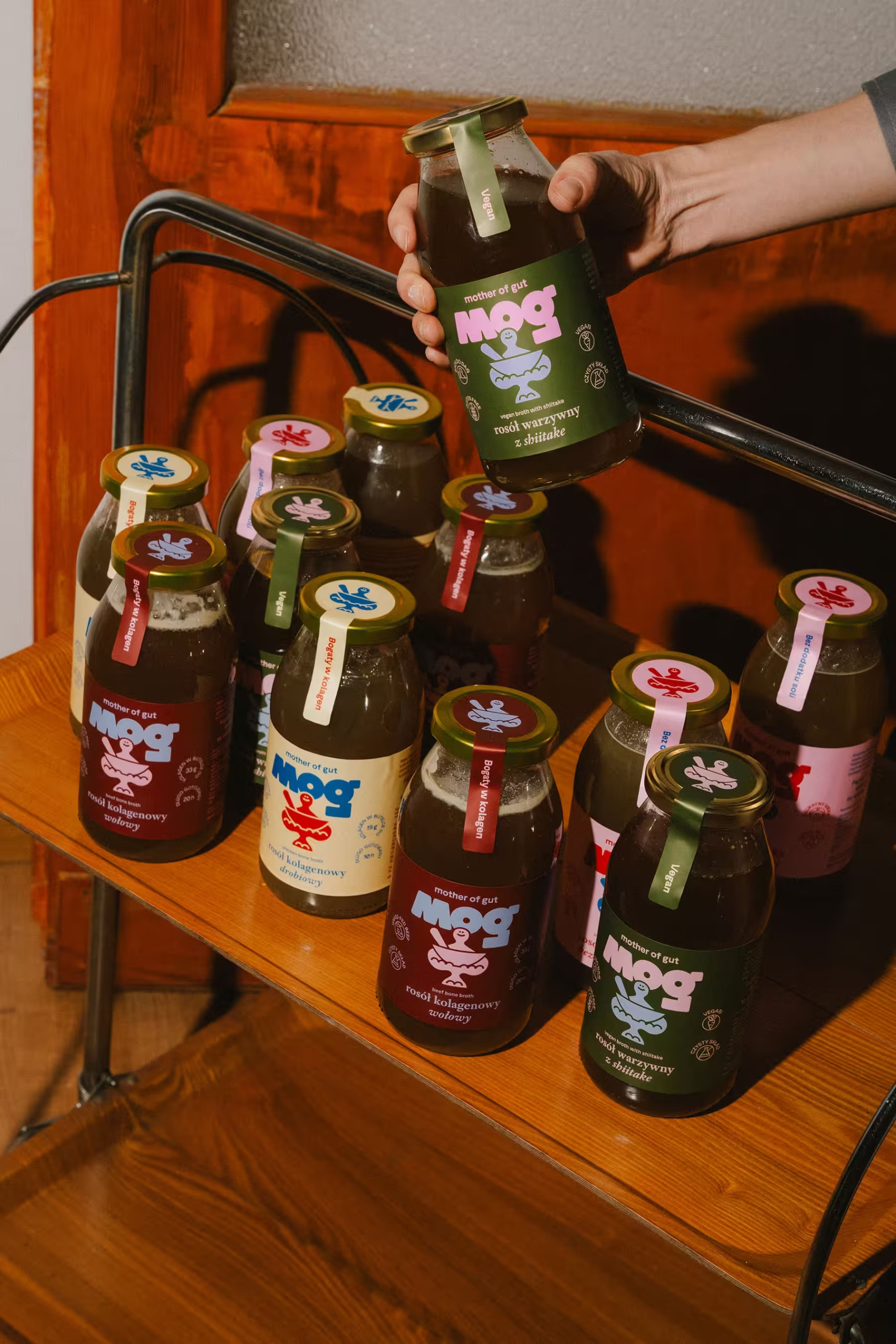
At the center of the identity is a custom logotype featuring a goddess-like figurine cradling a bowl of soup—a symbol of care and nourishment. The colour palette pulls directly from the vibrant folk art of the Mazovia region, the brand’s home, grounding the product in a specific sense of place.
I deliberately moved away from the clinical, sterile look often associated with modern health foods. Instead, the brand speaks through a “warm-vintage” aesthetic. By leaning into folk heritage and high-impact typography, Mog stands out on the shelf not just as a convenience product, but as a design-led tribute to the comfort of a home-cooked meal.
AWARDS:
Bronze Medal: Advertisement Creators’ Club, Category: Design for Brands